Five decisions that determine
whether your supply chain runs or falls apart.
Most supply chain software gives you data and leaves you to figure out the questions. KNOSC is built around the decisions that matter most. Your team spends time acting, not hunting.
See the 5 decisions guided live with real supply chain data.
Connect your data
We integrate with your existing systems (ERP, WMS, etc.), and partner systems. Automatically.
Single source of truth
All procurement, inventory, manufacturing, and sales data in one place, updated in real time.
Scenarios & simulations
Model any disruption in minutes. Understand the impact before it reaches your customers.
Act with confidence
AI-powered recommendations tell your team exactly what to do. And when to do it.
What do I need to order this week?
The Inventory Planning screen filters by Reorder Date within your chosen horizon. Knosc surfaces only the SKUs that need attention - with quantities that account for open POs, safety stock, MOQs, and supplier lead times. Your team reviews the suggested list, adjusts where needed, and converts to purchase orders.
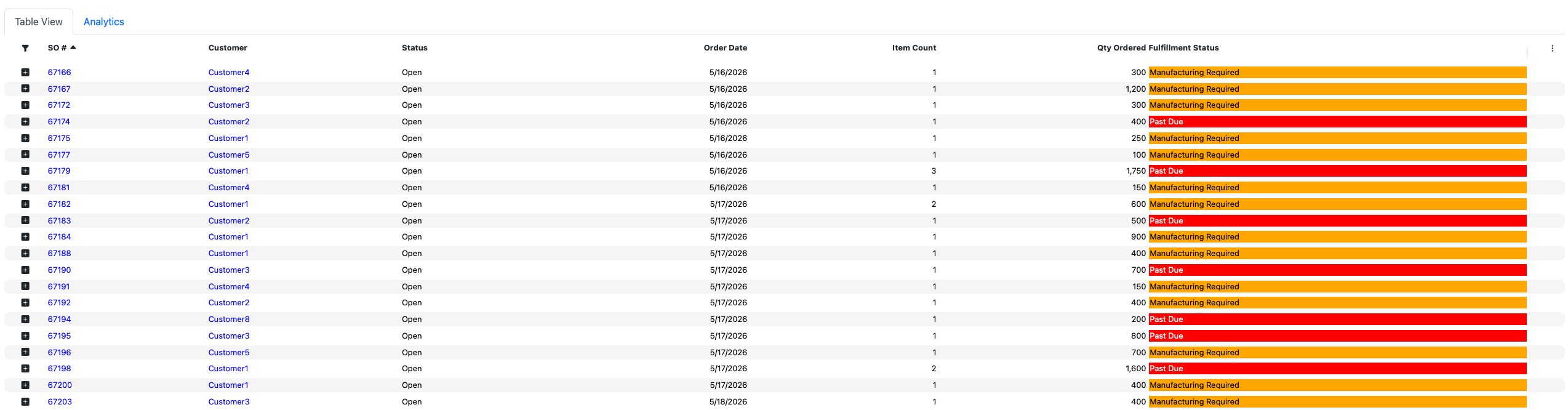
Which customer orders are about to be late?
The Sales at Risk screen shows every at-risk order colour-coded by reason - Past Due, Procurement Required, Manufacturing Required. You see the magnitude (how many days late, against which promise date) and exactly what action each order needs. You make the call first.
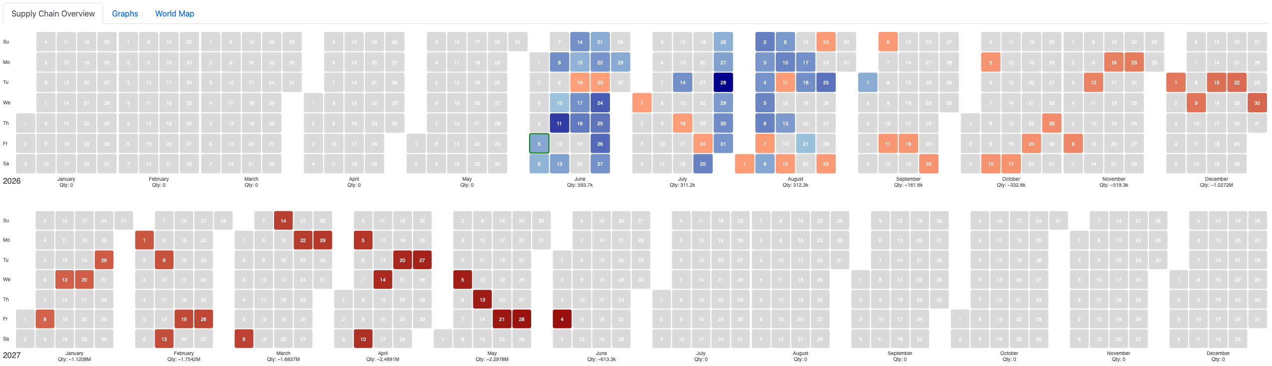
Are we heading for a stockout in the next 90 days?
The Inventory Heatmap maps every SKU's trajectory across time, colour-coded from surplus to deficit. You see the stockout forming months before it hits, while there's still time to reorder, reroute, or reprioritise. What most teams find out in June, Knosc shows you in March.
Dark blue = surplus · Red = stockout forming
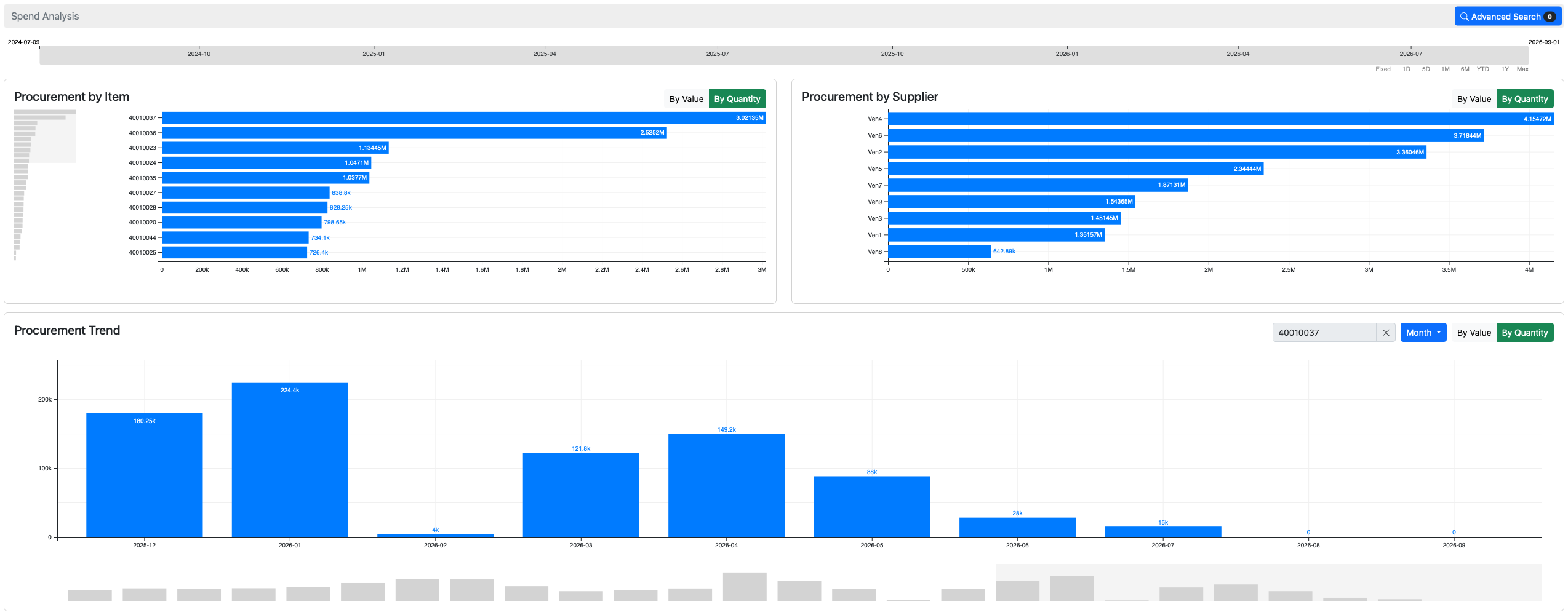
Which supplier should we buy from?
The Spend Analysis graph shows all your buying history, volume and price per supplier, across any time window. Before raising the PO, your team sees which vendor has performed best. No separate BI tool. No manual lookup.
What happens if a supplier cuts our allocation?
Type the change into the scenario analysis: a percentage cut, a delay in days, a demand spike. Knosc recalculates the impact across every SKU, every customer order, and every warehouse instantly. You know which orders are at risk, which customers to call, and what to reorder before the meeting ends.
To see how KNOSC can help you with your supply chain decisions
The answers are already there.
You just couldn't see them.
KNOSC's dashboards don't show you data. They show you problems before they become emergencies, and opportunities before competitors take them.
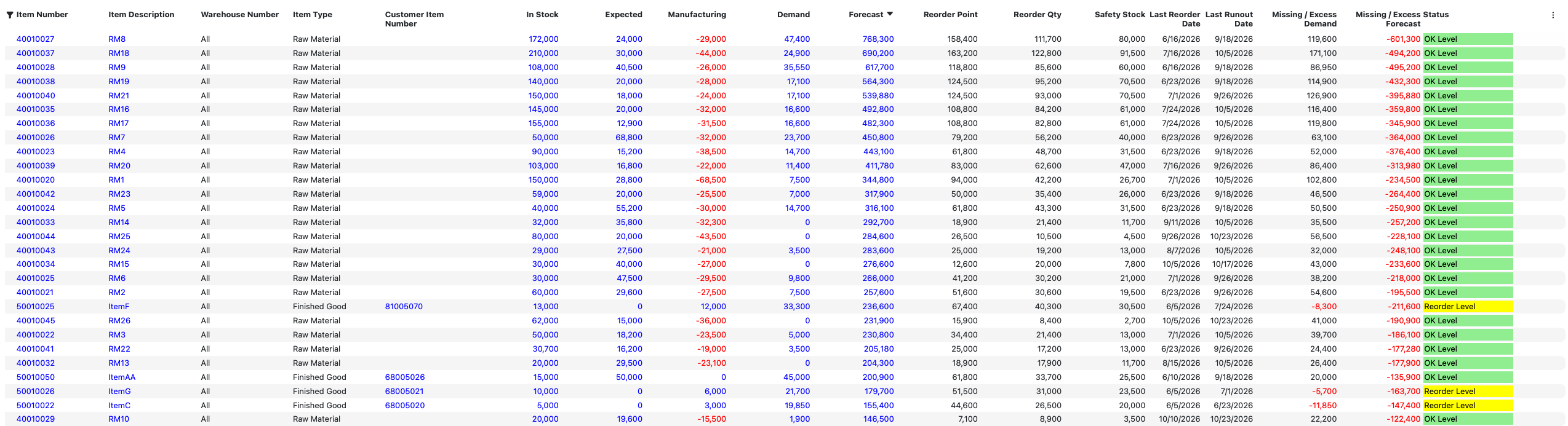
Every SKU's status, all at once. Without asking anyone to compile it.
The Inventory Planning screen gives every item a live status (Out of Stock, Runout Level, Overstocked, Reorder Level, Refill Scheduled, OK Level), calculated from its in-stock quantity, open purchase orders, manufacturing output, customer demand, and forecast. Reorder Point, Safety Stock, and Reorder Quantity are computed automatically.
Your team opens it and knows exactly what needs attention. Not after a weekly meeting. Not after an analyst pulls a report. Right now.
13% of open orders are delayed. You'd find out when customers call.
KNOSC's Sales Performance dashboard tracks on-time vs. late across every open and historical order. It shows you how many days late and against which promise date, so you can prioritise the most at-risk customer relationships, not the loudest emails.
See exactly which week each item runs out. Then act before it does.
The Transactions Flow view maps every SKU's starting inventory across your chosen time bucket. You watch Finished Goods inventory shrink week by week, and see precisely when each item crosses zero. Not a projection. A plan you can act on.
You negotiated 10,000 units at a fixed price. How much of that contract have you actually used?
When you have a supply contract, a committed quantity at an agreed price, Supplier Net Allocation tracks utilisation against it. See remaining allocation per SKU per supplier, catch over-commitments before they trigger penalty clauses, and know whether you're about to lose unused allocation at period end.
KNOSC shows you how accurate your forecasts were. Not many systems do that.
The Forecast vs Sales chart overlays historical sales against what was forecasted, month by month, going back years. MAE and RMSE accuracy metrics are shown on screen. You see exactly where the model was right, where it missed, and by how much.
Your inventory cliff arrives in June.
Most teams find out in June.
KNOSC's demand heatmap maps every SKU's net inventory position across time, colour-coded from deep surplus to deep deficit. You see a stockout forming months before it hits, while there's still time to reorder, reroute, or reprioritise.
The heatmap aggregates across all warehouses and factors in open purchase orders, manufacturing output, and forecast demand. Each cell represents net inventory for that month. Positive means you're covered, negative means you're not.
Without this view, operations teams run reactive. With it, the June crisis never makes it to the weekly update because someone saw it in March.
Not just "reorder when low."
Reorder the right amount, at the right time, from the right supplier.
KNOSC's reorder recommendations incorporate every variable your team used to calculate manually, including a few they probably missed.
Safety stock computed per SKU from velocity, not set by gut feel and never revisited.
KNOSC calculates safety stock for every item based on demand variability and lead time. Not a flat buffer across all SKUs, but a number that reflects how that specific item behaves. It recalculates automatically as demand patterns change.
A 7-day rail delay automatically shifts every reorder date for every affected SKU.
Reorder recommendations respect MOQ constraints so you're never creating a PO below supplier minimums. Lead times incorporate port and rail ETAs so a shipment routed by rail automatically adds transit buffer. When an ETA shifts, the reorder window shifts with it.
All your buying history. Instant supplier comparison. Before you raise the PO.
The Spend Analysis graph shows how much was purchased from each supplier and at what price, across any time window. Your team sees which vendor has the best historical reliability and price before committing to the order. No separate BI tool. No manual lookup.
Review the recommendations. Accept what makes sense. Raise the PO in one click.
KNOSC generates suggested purchase orders based on your inventory planning. Your team reviews the list, adjusts quantities where needed, and accepts. Accepted suggestions convert to purchase orders automatically. No re-entering data, no spreadsheet handoff.
A supplier just cut your order
by 30%. Here's what breaks
before you find out the hard way.
In most companies, a supplier disruption triggers a crisis meeting, three days of spreadsheet work, and a plan that's already out of date. With KNOSC, you type in the numbers, and the full impact across every SKU, every customer order, and every warehouse is visible in seconds.
Model a procurement cut, a demand spike, or a shipping delay. Then see the ripple.
KNOSC's scenario analysis lets you adjust any variable: quantity, percentage change, or delay in days, at the line level or globally across all orders. Procurement scenarios model supplier disruptions. Forecast scenarios model demand changes. Both apply instantly across your entire supply chain.
No data exports. No analyst. No waiting for the next planning cycle. The answer is there before the meeting starts.
See exactly which SKUs flip from OK to critical. And which customers they serve.
The Compare Inventory Planning view shows your baseline and scenario side by side for every item. Items that were "OK Level" become "Reorder Level" under the scenario, highlighted immediately, before a single unit has moved.
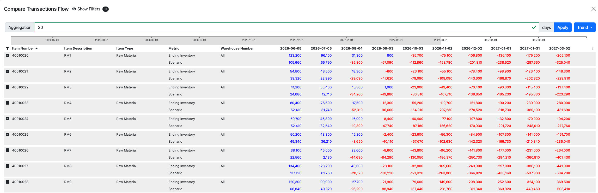
Day by day: see which items go negative under the scenario that were fine before it.
The Compare Transactions Flow shows baseline ending inventory vs scenario ending inventory for every item, every day. Some items go negative under the combined procurement cut and demand spike, when they were comfortably positive under normal conditions.
The baseline goes negative in June. The scenario goes negative in March.
The Compare Heatmap renders your baseline and scenario calendars side by side, colour-coded from surplus to deficit. A three-month acceleration of the inventory cliff is not a spreadsheet problem. It's a crisis that needs to be addressed today.
New customer orders are now exposed under the scenario. You know before they do.
The Compare Sales at Risk screen shows which customer orders are at risk in the baseline, and which additional orders become exposed under the scenario. New Procurement Required statuses appear on orders that looked fine before the disruption.
See every decision live.
Book a 30-minute demo and we'll walk through your actual supply chain decisions. Not a scripted product tour.
To see how KNOSC can help you with your supply chain decisions